- info@artawa.ca
- Newsletter/Substack
- Meets the 2nd Sunday of every month except July & August
- Ottawa Art Gallery Studio, 10 Daly Ave. Ottawa, Ontario, Canada
Mandate & Mission
Artawa is a grassroots collective dedicated to dismantling the systemic and financial barriers faced by creatives in the National Capital Region. Our mandate is rooted in radical inclusivity, with a specific focus on providing a safe, low-barrier haven for equity-deserving groups, including BIPOC, LGBTQ2S+, and artists with visible and invisible disabilities.
We prioritize a trauma-informed approach to community building, ensuring our “Monthly Artawa Meetups” are sensory-friendly, physically accessible, and free of charge. By providing professional-grade facilities and peer-to-peer mentorship, we foster a culture of mutual support where artists from marginalized sectors can transition from private practice to public exhibition. Our leadership includes artists with lived experience in the disability community, ensuring that accessibility is a core pillar of our operations – not an afterthought.
Our mission is to empower local creators to reclaim their artistic agency, boosting their confidence through a year-end, non-juried, themed exhibition that welcomes everyone from hobbyists to professionals. Having the end of year show theme discussed and decided upon by everyone together will help create cohesion and unity in every aspect.
Artawa seeks to sustain a diverse, supportive ecosystem where the “messy magic” of creation serves as a tool for social connection, professional growth, and community-wide healing.
Artawa meets on the 2nd Sunday of the month at the Ottawa Art Gallery , unless otherwise stated in the Events.
About our Logos
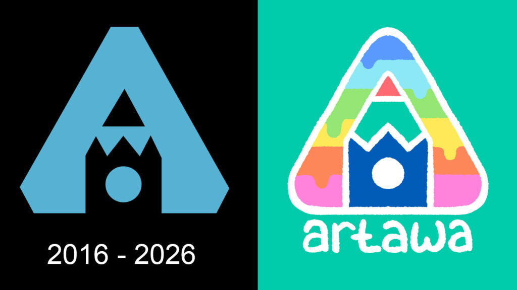
We felt as if a re-branding was for our 10 year anniversary! Our previous logo was generously provided and beautifully designed by Artawa’s own Sarah O’Neill. So many hidden gems in this one that we wanted to keep. The “A” layout which represents the “A” for Artawa, as well as creating a peace tower from Ottawa’s parliament in the center, which doubles as a pencil.
For the revamp we wanted to keep the overall triangular shape, and the peace tower, however the logo has been updated with a softer, gentler, more handmade feel; to accentuate our value of being a safe, inclusive space for all to create. When looked at closely, the line quality is rough with a hand-made quality to remind us that art is an inherently human phenomenon. This logo was created by hand and polished using digital drawing tools and no AI whatsoever.
We used Ottawa’s official colours (the darker blue and green) in the peace tower, with the red on top with the Algonquin Anishinabeg Nation’s flag in mind (featuring blue, black and red in its center). The background spectrum of colour echoes elements of the Progress Pride flag, again reminding us that all are accepted and welcome. The extra drips are a fun nod to messy creativity, paint, and play.
We hope this new logo serves as a reminder that art is for everyone. It reflects our commitment to building a strong, inclusive creative community where we lift each other up and foster healthy relationships. Ultimately, we believe that maintaining a lighthearted sense of play is the most effective path forward for artistic expression, creativity, and growth.